Provide a data frame with event data to create a static timeline plot created by ggplot2. Simplest drawable dataframe can have columns `event` and `start`.
gg_vistime(
  data,
  col.event = "event",
  col.start = "start",
  col.end = "end",
  col.group = "group",
  col.color = "color",
  col.fontcolor = "fontcolor",
  optimize_y = TRUE,
  linewidth = NULL,
  title = NULL,
  show_labels = TRUE,
  background_lines = NULL,
  ...
)
Arguments
- data
data.framethat contains the data to be visualized- col.event
(optional, character) the column name in
datathat contains event names. Default: event.- col.start
(optional, character) the column name in
datathat contains start dates. Default: start.- col.end
(optional, character) the column name in
datathat contains end dates. Default: end.- col.group
(optional, character) the column name in
datato be used for grouping. Default: group.- col.color
(optional, character) the column name in
datathat contains colors for events. Can be hex codes (e.g., "#FF0000"), named colors (e.g., "red"), or categorical data to be auto-colored. Default: color, if not present, colors are chosen viaRColorBrewer.- col.fontcolor
(optional, character) the column name in
datathat contains the font color for event labels. Default: fontcolor, if not present, color will be black.- optimize_y
(optional, logical) distribute events on y-axis by smart heuristic (default), otherwise use order of input data.
- linewidth
(optional, numeric) the linewidth (in pixel) for the events (typically used for large amount of parallel events). Default: heuristic value.
- title
(optional, character) the title to be shown on top of the timeline. Default:
NULL.- show_labels
(optional, boolean) choose whether or not event labels shall be visible. Default:
TRUE.- background_lines
(optional, integer) the number of vertical lines to draw in the background to demonstrate structure (default: heuristic).
- ...
for deprecated arguments up to vistime 1.1.0 (like events, colors, ...)
Value
gg_vistime returns an object of class gg and ggplot.
See also
Functions ?vistime and ?hc_vistime for different charting engines (Plotly and Highcharts).
Examples
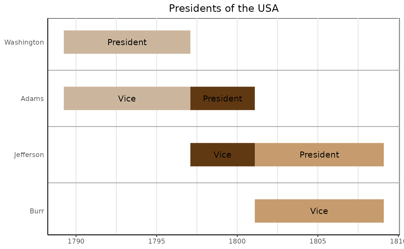
# presidents and vice presidents
pres <- data.frame(
  Position = rep(c("President", "Vice"), each = 3),
  Name = c("Washington", rep(c("Adams", "Jefferson"), 2), "Burr"),
  start = c("1789-03-29", "1797-02-03", "1801-02-03"),
  end = c("1797-02-03", "1801-02-03", "1809-02-03"),
  color = c("#cbb69d", "#603913", "#c69c6e")
)

gg_vistime(pres, col.event = "Position", col.group = "Name", title = "Presidents of the USA")


if (FALSE) { # \dontrun{
# ------ It is possible to change all attributes of the timeline using ggplot2::theme()
data <- read.csv(text="event,start,end
                       Phase 1,2020-12-15,2020-12-24
                       Phase 2,2020-12-23,2020-12-29
                       Phase 3,2020-12-28,2021-01-06
                       Phase 4,2021-01-06,2021-02-02")

p <- gg_vistime(data, optimize_y = T, col.group = "event", title = "ggplot customization example")

library(ggplot2)
p + theme(
  plot.title = element_text(hjust = 0, size=30),
  axis.text.x = element_text(size = 30, color = "violet"),
  axis.text.y = element_text(size = 30, color = "red", angle = 30),
  panel.border = element_rect(linetype = "dashed", fill=NA),
  panel.background = element_rect(fill = 'green')) +
  coord_cartesian(ylim = c(0.7, 3.5))
} # }
if (FALSE) { # \dontrun{
# ------ It is possible to change all attributes of the timeline using ggplot2::theme()
data <- read.csv(text="event,start,end
Phase 1,2020-12-15,2020-12-24
Phase 2,2020-12-23,2020-12-29
Phase 3,2020-12-28,2021-01-06
Phase 4,2021-01-06,2021-02-02")
p <- gg_vistime(data, optimize_y = T, col.group = "event", title = "ggplot customization example")
library(ggplot2)
p + theme(
plot.title = element_text(hjust = 0, size=30),
axis.text.x = element_text(size = 30, color = "violet"),
axis.text.y = element_text(size = 30, color = "red", angle = 30),
panel.border = element_rect(linetype = "dashed", fill=NA),
panel.background = element_rect(fill = 'green')) +
coord_cartesian(ylim = c(0.7, 3.5))
} # }